Article by Tanner Rogers
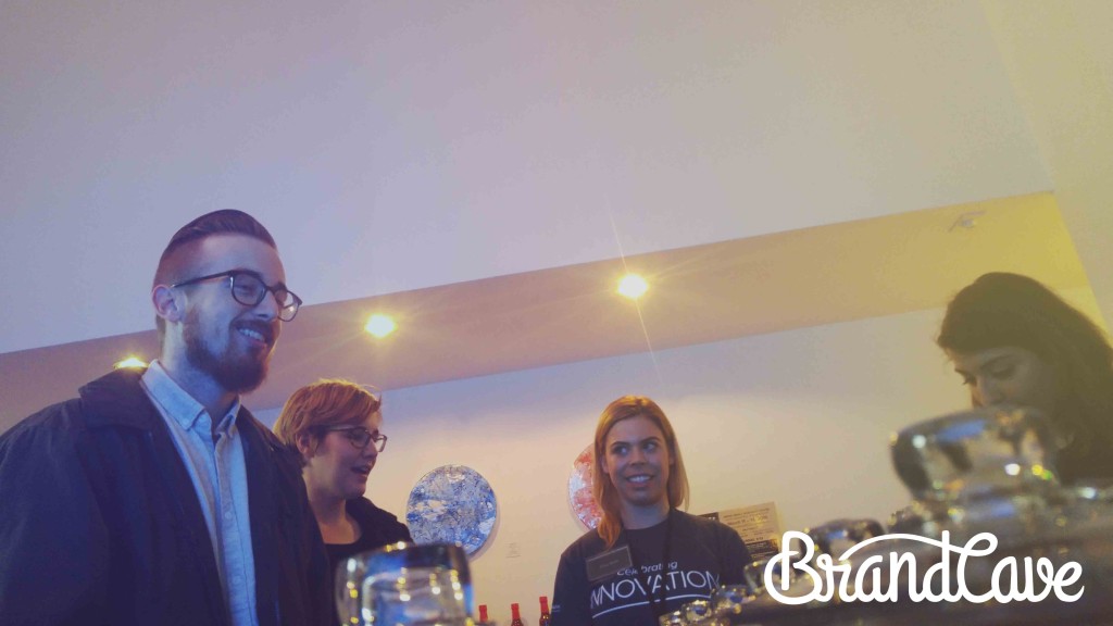
Recently, I took a field trip with the rest of the Brandcave team to Downtown Austin during SXSW Interactive. For nerds like me, nirvana can be reached during interactive week. All across the city, different live forums, speeches and events are held for startups and enterprise companies alike. From talks on building brands to creating a “Secret Sauce” for small businesses, interactive week is a great way to learn from leading experts in business.
We spent the majority of our day sitting in on a string of lectures on User Experience (UX) and User Research hosted by General Assembly. These lectures were taught by a wide range of stellar UX consultants including CEOs, brand managers and even members of the IBM Design team. Although it soon became clear to me that UX is much bigger than app and web design, I couldn’t help but think of several unique web design hacks that could dramatically improve your visitor’s experience. Here’s what I learned:
1. Distill Complexity
Simplicity is the end goal of any design and that sentiment leaks into how we build for the web. Behind every great website is an intricate and complicated concept that has been distilled into a clear, concise message. When a visitor lands on your homepage, for example, they should be able to understand 1) who you are, 2) what you do and 3) how it affects customers within the first three seconds. That’s the rule of thumb. If the message isn’t clear enough, it needs to be revised. So, how do you know if your message is clear enough? Well, you could pay this guy to get drunk and tell you.
Behind every great website is an intricate and complicated concept that has been distilled into a clear, concise message.
Not every visitor on your site is going to be an expert in web experiences, so making your site clear allows more visitors to feel comfortable with using your site. Bad user experience begins with confusing layout, content and navigation.
2. Create Digital Sales Funnels
How do you improve user experience? You encourage the user to go deeper. That’s the mission of a call to action (CTA). Calls to action provide an opportunity for the user to take their next step, whatever it is, and move down the sales funnel. Whether their next step is visiting another page, subscribing to a newsletter, requesting a demo or downloading an eBook, every page should end with a clear call to action.
Of course, there’s a psychology to clear call to actions. They should stand out from the rest of the website’s design in a clear visual hierarchy. They can often appear as buttons, inline text or even a strategically placed pop-up. Can they have the potential to be annoying? Absolutely. But, they’re meant to disrupt the user’s progression through the site. Done correctly, however, the user should feel like it is the next logical step through your website.
3. Make it Useful For Everyone
Valeria Spirovski, an experience designer for ThoughtWorks, wrote a fantastic blog comparing Pixar storytelling and UX. In it, she wrote “it’s hard to understand the perspective of a layperson when you’re in the position of expert.”
That’s dead on. Naturally, some of your website’s visitors are not going to be industry experts. Because of this, it’s important to create a site that’s useful for every person in the sales funnel.
When examining your own site, attempt to put yourself in the position of every possible visitor. Maybe they know their industry well but they aren’t aware of the industry’s contemporary technology. Maybe they’re an industry expert who is comparing technical specs between you and your competitors. Whoever it is, the site should be useful for them.
How do you do this? Define terms, avoid acronyms and industry jargon, make your visitors understand your product at it’s most basic and intricate levels. Consider the user who has visited your site once and the user who has returned three or four times. Create opportunities to target visitors at different parts of the sales funnel.
4. Drop Stock Photos and Hire a Photographer
Why should you invest in a professional photographer? Because real photos on your website can improve your user’s experience. And, let’s face it, stock photos don’t accomplish much. Real photos of your team in action, in their office, with customers or together at lunch can help your audience connect with your company on a personal level. Research shows that seeing someone’s face can have a dramatic effect on how you view and understand that person.
Spending the time and money on a professional photographer will pay off when your customers see your website as genuine and relatable. Professional pictures of you, your team, and your capabilities shows the real you, not some contrived version of you.
5. Conduct User Research
Do you understand your visitors? Probably not as well as you think you do. It is crucial to ask for feedback on your website because, at the root of user experience is user research, not domain expertise.
Liya James, Creative Director of Idean Austin, spoke at SXSW about lean user research. She described it as “research you do with existing or potential customers as a way to get rid of assumption while identifying needs.” Beyond A/B testing, surveys and drunk testing, Liya suggested performing sit down interviews with existing customers. She encourages companies to embrace genuine conversation with customers by asking who they are and how their problems could be solved.
… At the root of user experience is user research, not domain expertise.
If you’re the founder of your company, do you remember when you validated the idea for your business? How much research did you have to do? Why would we think that we could make a great user experience on our website without the same amount of care and attention?

Building a Unique Web Design
User experience is not solidified. There is no clear-cut definition of it, but it is clear that positive user experience begins with a unique web design. Understand your customer, get to know who they are, work to fix their problems and fulfill their needs. As for Brandcave, we desire to know you before we know your vision. Give us a call. We would love to meet you.

